26 Nov 2013

Coverlines

I then created a page to plan my cover lines. I researched and looked at the magazines I had googled and had on pinterest earlier for inspiration. I included a range of cover lines and did ones with puns, alliteration, puff lines, rhetorical questions and exclusives. This was to make the coverlines eye catching and interesting on the front of the magazines.


24 Nov 2013

Magazine Research

Pinterest

For part of my magazine research I used an online program called pinterest. Pinterest is a program where you can search for a topic you are interested in, and you can 'pin it' so that images associated with that topic appear on you home page. I used Pinterest to search for fashion magazine layouts, so to gain inspiration and ideas for my own magazine when I start designing it.


Google Image Search
I also used google image search. I used this as google images provides a range of images according to the topic you search. Therefore as you can see from the screenshot I have gained a lot of pictures of fashion magazines. Which I can use for inspiration when thinking of colours and headings for the cover and double page spread.


 Physical Research
The final method of magazine research I did was I went into town and into WHSmith. So that i could physically look at different fashion magazines for inspiration and so I could actually look through the magazines myself and see the double page spreads. I think these 3 methods of research are the most efficient and useful as they provide a large range of different and interesting


15 Nov 2013

Own Magazine Recreation


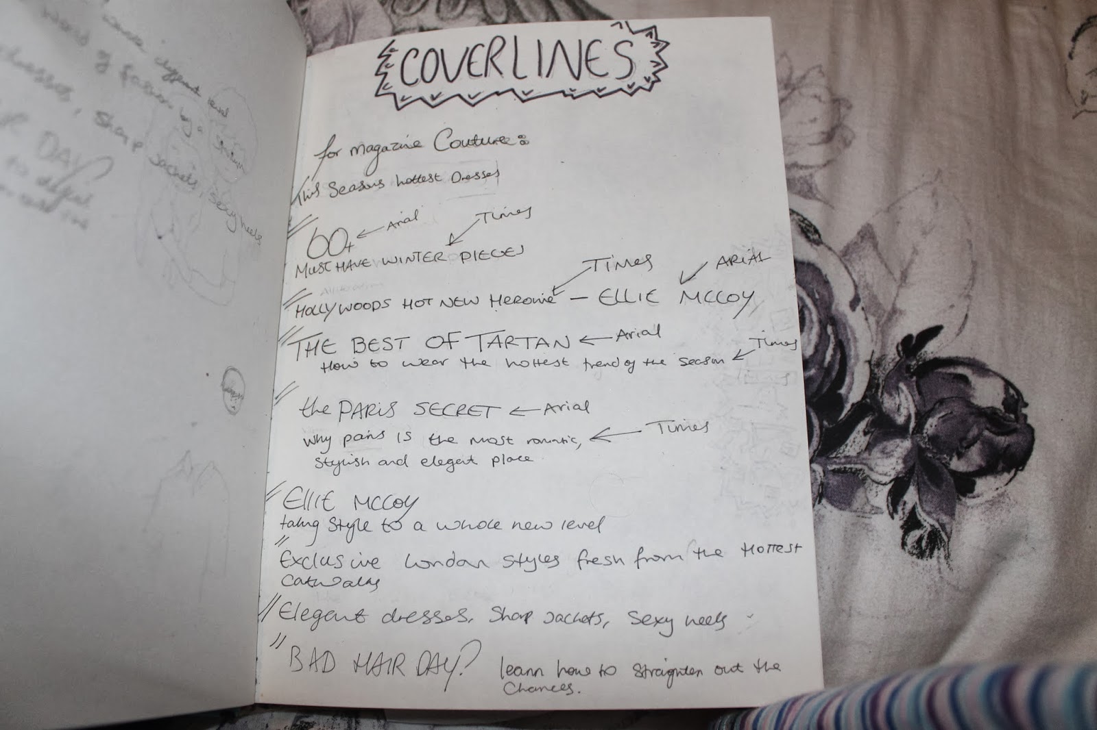
Our next task was to once again recreate a magazine, but choose it ourselves. Using our own picture and making it from scratch. This was a helpful task as it once again got us used to the conventions of a magazine, helped us learn Indesign and we were able to recreate something of our choice so we could see the elements needed for our own subject matter. I chose the magazine as this fashion and beauty magazine is the type of magazine I am hoping to create, and also holds the same target audience that my magazine will have. If I was to change anything I would ensure my model of the magazine was dressed more similarly to the original design, align a few bits of the text and add white boxes on the right corner so my version was more like the original.


Original


Creating own font

I created the brush type myself using ink and a small brush, as I found it would add originality to my piece and, this type was quite hard to find and I could replicate it better and get it closer to the real thing. I edited the type on Photoshop and made them cleaner and neater so they looked professional. I also inverted the 'high street edited' cover line as it was white writing on a black background. I sourced all the other fonts myself from DaFont, which was a useful website as it built up my knowledge of the different fonts there were available.


Working Progress
This is a screenshot of the magazine in its working stages in Indesign. I used my own image, as I used my sister to be the model of the magazine. I sourced all the other fonts myself from DaFont, which was a useful website as it built up my knowledge of the different fonts there were available.


Image

Final picture for my recreation of Company magazine. I used my own image and used my sister as the model, so was able to get her to pose in the right position ensuring my magazine was similar as possible to the original.


Final Piece
Below is my final recreation of the magazine. I have included all the conventions featured such as title, model, cover lines, graphic detail and images. I created the boxes and graphic detail myself on Photoshop, created some of the type myself and used my own image. This promoted originality and made the recreation unique. I sourced the other fonts and images of clothing from the internet, such as DaFont for type and google images for the items of clothing I needed.


14 Nov 2013

Magazine Title

To come up with a name for my magazine, I made a brainstorm of words associated with fashion that could form a name for my high-end fashion magazine. These words were in categories such as - types, tools, existing, adjectives and terms + slang. I then selected words which I thought were appropriate for my magazine and ones that sounded the best - So i chose 'Couture' as the final name as it means 'high end fashion' which is what my magazine will mainly be about.


12 Nov 2013

CRAP Analysis

John's Awful Business Card

This is a poorly designed business card our teacher gave to us, our task was then to recreate the business card showing each format of Type Dynamics. Below are my designs for a Concord, Conflict and Contrasting business card.


Concord 
This card is concordant as the type on the card is all just one font. This makes the card look dull and boring.


Conflict
This card is conflicting as both fonts are very similar, as both carry the handwritten/ script look. But they are clearly different so making the card look messy and badly designed.


Contrast
I have tried to make the contrasting look clear on this card by using 3 different alignments, 4 different types, italics, bolding, gradients and different sizes. This makes the card look really messy, unprofessional and disorderly.  


Working Progress
This is a screenshot of my business card in photoshop. We used photoshop as it is easy to download fonts onto and it is easy move elements around the page to create your project.


Final Product of NME recreation

Original Artefact
This is the original magazine cover, our task was to reproduce this is Photoshop. We had to use our own pictures, find our own fonts and place the elements in the right places.


Working Progress

This is a screenshot of my final product in indesign next to the original copy of the NME magazine. Our task was to recreate the NME magazine as closely as possible to reproduce an exact replica.


My Version
Below is my recreation of the magazine above. I recreated this on photoshop, I took my own images for it and downloaded typefaces for it off the internet. I downloaded the fonts for free off a website called 'Da Font'.


Using Own Photo & Editing


Original Photo
This is the original photo which I took myself. I used students out of my class to pose for the photo, in hoping to recreate the image on the magazine cover.


Working Progress
Below is a screenshot of my image in Photoshop. I edited the image by altering the saturation, levels and contrast. This was done to make the colours in the photo more vibrant and to stand out, and look professional overall.


Final Edited Image
This is my final edited image which I used for my magazine front cover. This image was used to represent the band 'Bombay Bicycle Club'.


11 Nov 2013

NME Magazine Working Progresses

Object Styles
This is a screenshot of the progress of my product, showing the use of Object Styles. Object styles was used as on the magazine a lot of repeated shapes were used. So to save time and make it easier to create, we would draw a shape that we wanted, add it to object styles and name it. Then when we next wanted to use a re box we  would create a shape, and then click on the object style that we have already made to get the shape we desire.


Character Styles
This is a screenshot of the progress of my product, showing the use of Character Styles. Character styles was used as the magazine has a lot of repeated text. So to save time and make it easier to create, we would create text and edit it how we wanted it, and then add it to character styles and name it. Then when we next wanted to use that same style of text we would create a text box, write in it, and then click on the character style that we have already made to get the style we desire.


Working Progress
This is a screenshot of the working progress of the magazine in Indesign. We used Indesign as it is a efficient and quite easy program to use. This is because it has a variety of tools to help recreate the magazine as closely as possible.